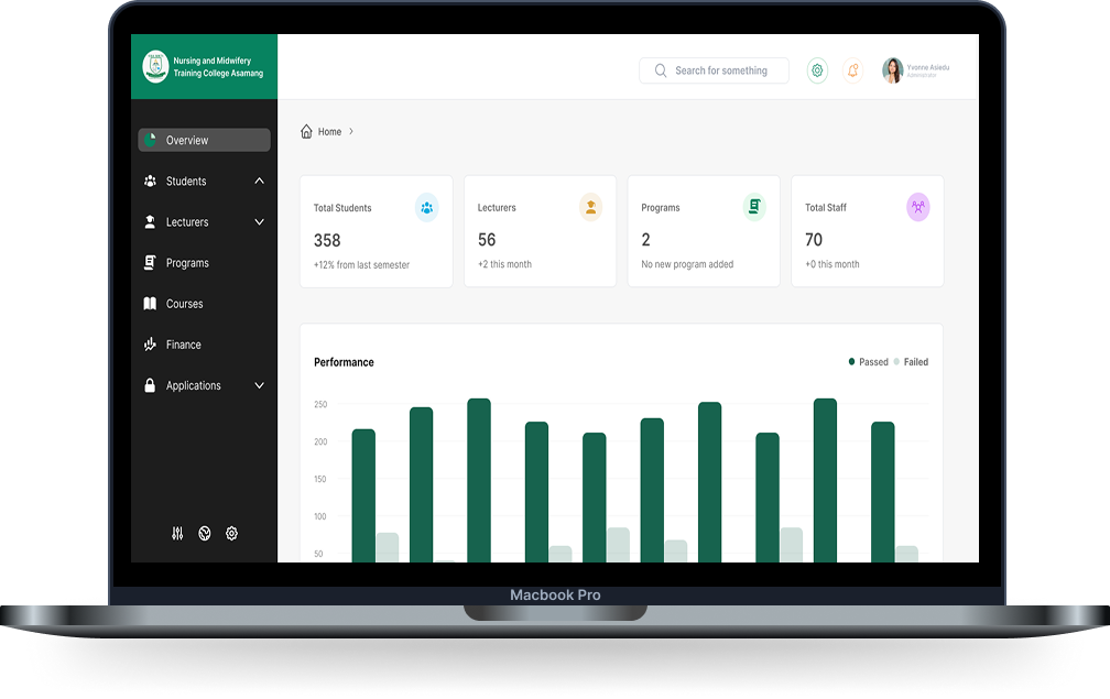
Asamang NMTC School Management System
Digitizing school administration to replace inefficient paperwork with a structured, user-friendly digital platform.
Introduction
- Industry: Education
- Role: UX/UI Designer
- Timeline: 2025
- Tools: Figma, Google Forms, Notion
- Aim: Digitizing school administration to replace inefficient paperwork with a structured, user-friendly digital platform.
- Target Users: Academic registrars, admin assistants, IT admins, and students
Research Insights
Key Findings
Manual Data Entry
Course and student data were recorded manually and inconsistently
Assignment Errors
Lecturers were sometimes assigned to the wrong batches
Academic Structure
Academic year setup lacked structure and traceability
Real-time Access
No real-time access to student records
Data Accuracy
Error-prone data entry
User Management
Fragmented user roles and permissions
Competitive Analysis
Market Research
I analyzed existing school management systems to understand the market landscape and identify opportunities for improvement.
Key Competitors Analyzed:

PowerSchool (International)
- • Comprehensive but complex interface
- • High cost and extensive training required
- • Over-engineered for smaller institutions

Moodle/Canvas (Learning Management)
- • Focus on course content, not administrative tasks
- • Limited student registration and batch management
- • Poor role-based access control for staff

Generic ERP Systems
- • Not designed for academic workflows
- • Complex setup and maintenance
- • Expensive licensing and infrastructure
Market Gaps Identified:
- • Simplicity: Existing systems are too complex for non-technical staff
- • Cost: High licensing fees make them inaccessible to smaller institutions
- • Localization: Lack of features specific to nursing college workflows
- • Accessibility: Poor mobile experience and offline functionality
- • Integration: Difficult to integrate with existing paper-based processes
Our Competitive Advantages:
- • User-Centered Design: Built specifically for nursing college workflows
- • Affordability: Cost-effective solution for smaller institutions
- • Simplicity: Intuitive interface requiring minimal training
- • Mobile-First: Accessible on low-end devices with poor connectivity
- • Role-Based: Tailored interfaces for different user types
User Personas

Yvonne – Academic Supervisor, 42
Needs to manage academic years, batches, and lecturer assignments
Pain Points:
- • Manual paperwork for batch and academic year setup
- • Lecturer assignments often duplicated or mismatched
- • No structured view of academic records

Derrick – Admin Assistant, 27
Handles student registration and data entry
Pain Points:
- • Bulk student entry is time-consuming and error-prone
- • No status feedback or validation in manual processes
- • High chance of duplicate or missing records

Jeph – IT Admin, 38
Manages user accounts, roles, and permissions
Pain Points:
- • No centralized system for access control
- • Manual onboarding of new staff
- • Difficulty revoking or modifying roles without affecting others

Esi – Student, 20
Accesses her results, course info, and profile
Pain Points:
- • No self-service portal to check academic results
- • Has to rely on staff to verify enrollment
- • Lack of mobile-friendly access to personal academic data
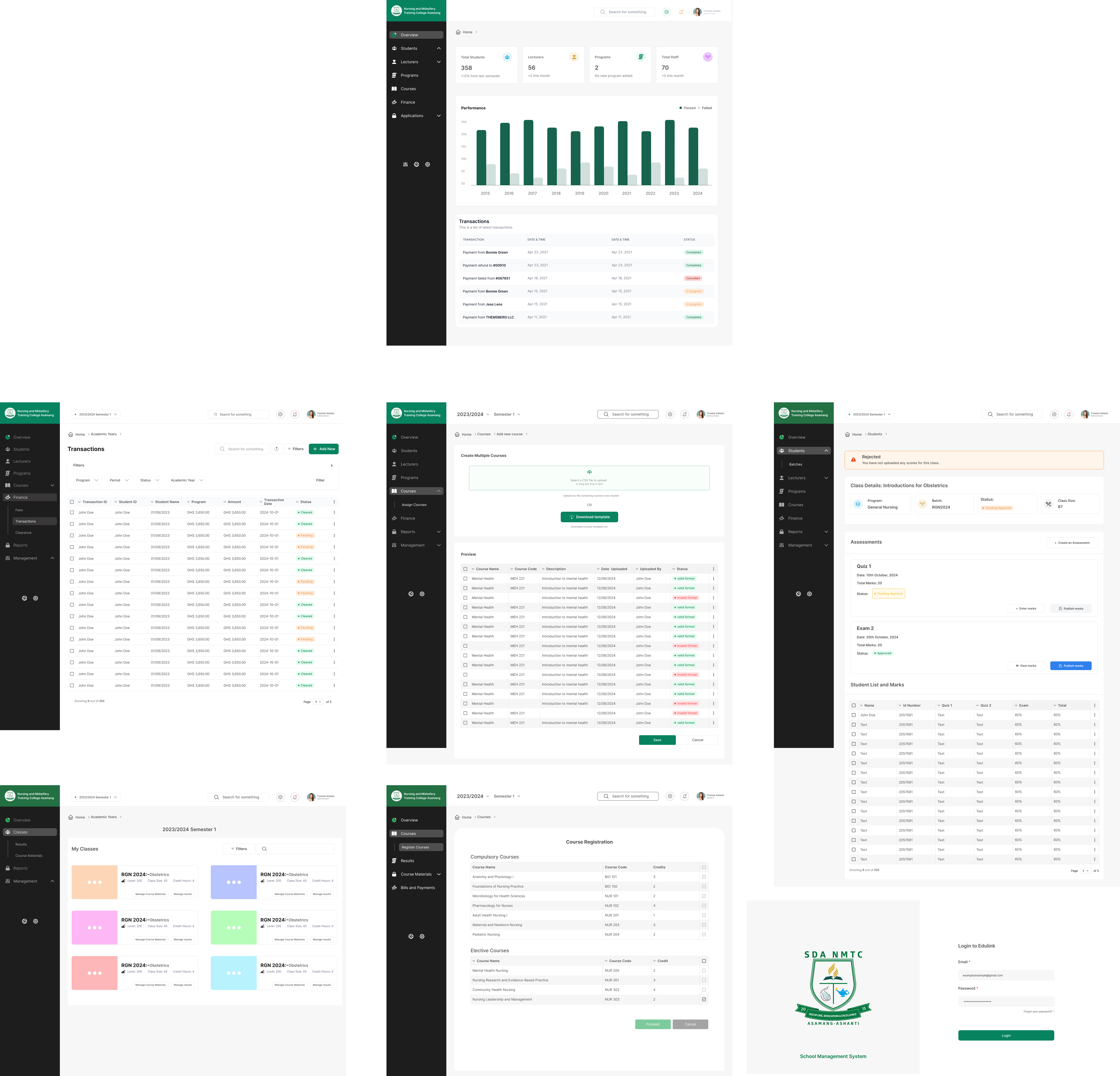
Design Process
Key Design Decisions
Modular Architecture
Designed modular sections for managing students, lecturers, courses, results, and roles
Bulk Operations
Integrated bulk upload tools to speed up data entry
Role-Based Views
Created role-based views to reduce clutter and guide user interaction
Visual Hierarchy
Used color-coded roles and clean forms for non-technical staff
Mobile-First Approach
Made the student portal mobile-friendly for easier access on low-end devices
Outcomes
Digital Transformation
Reduced dependency on paper-based records
Centralized Access
Enabled centralized academic data access
Scalable Architecture
Built with modular UI patterns for future scalability
Skill Development
This project helped sharpen skills in designing enterprise tools that feel as intuitive as consumer apps
Challenges
Context-Aware Environment
Ensuring actions like result entry or student registration only applied within the selected academic year and semester, without overcomplicating the UI.
Visual Balance
Refining button color shades (especially greens) to strike the perfect tone — clean, accessible, and not overwhelming.
Role-Based Views
Designing interfaces tailored to user roles while preventing clutter and maintaining quick access to key actions.
Data Isolation
Carefully structuring the UI so that academic-year-specific data remained isolated — reducing accidental edits across terms.
Minimalism vs Functionality
Stripped-down layouts were deliberately chosen to reduce friction, while still preserving critical functionality like status indicators and filters.